
"Trends" shows how revenue and profit change over time — unlike the "Business" card on the "Money" page, which just shows current figures with no chart.
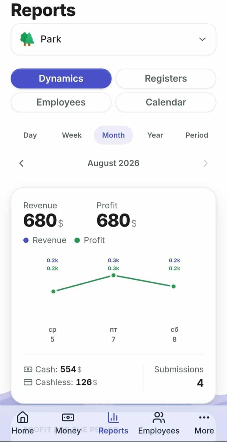
- Open "Reports" — the "Trends" tab is open by default.
- If you have more than one point — choose the one you need at the top (or "All Points").
- Choose a period: Day, Week, Month, Year, or your own date range.
- At the top — large "Revenue" and "Profit" figures, below — a chart by day/week/month.
- Below the chart — a short line of payment methods (Cash/Non-Cash) and the number of submissions for the period.
- Below that — a "Profit for the Period" card: Revenue minus Expenses minus Staff Salaries equals Profit.
What to Do If… #
…there is no data at all for the period? You will see a "No data for this period" message — days with no submissions or expenses at all simply do not appear on the chart.
…the chart does not fit on the screen ("Month" mode)? It scrolls horizontally — with the arrows on the sides or by swiping.
 Русский
  English
  Українська
  Italiano
  Română